Other Studio Pages:
2004 (Aug-Dec) | 2005 (Jan-May) | 2005 (May-Aug| 2005 (Aug-Dec) | 2006 (Jan-Apr)
2006 (May-Dec) |2007 (Jan-Aug) | 2007 (Aug-Dec) | 2008 | 2009 | 2010 | 2011-2012 | 2013 | 2014-16 | 2017 | 2018 | 2019
2007
1/1
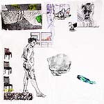
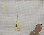
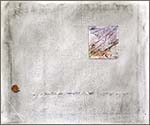
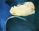
Used the ideograph Modern Man on top of the pink dribble rectangle that surrounds the piece of paper scraps I affixed the other day. Painted over a trite rectangle. Going to call the piece (48 x 36 canvas) Icarus, rejuvenating the theme, via Brughel. My guy realizes his smallness, but is ready to stand up, not Existentially, but because the Cosmos is.
1/2
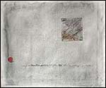
An email conversation led to renewed work on Emerson's Nature (12/13/06). (Which I finished on 3/4/2007)
Date: January 2, 2007 2:01:29 PM CST
To: rastanley@comcast.net Hi Bob I am glad you an interested in the Cicero project [commenting on "A Life Well Spent"]. I have some others interested as well, so it could shape up to something of interest at least to the contributors, if not a publisher. I also like your example from the Tempest. We so often truncate our maxims form their context and in so doing reverse their meaning, as in Frost’s “wall make good neighbors” taken out of context where in it intends the opposite. Maybe neither old nor new is THE ultimate values, the Alpha AND the Omega. We find, that each is vital in its own way to each situations. Alas. The Marx Brothers were right: Life is a pair of ducks: “Good Grief.”
Don From: rastanley@comcast.net
Subject: Re: old age not for sissies
Date: January 2, 2007 3:06:51 PM CST
To: donaldwigal@ix.netcom.com
Don,
Funny you should mention "ducks." A recent drawing, working out certainties and physical realities, and containing the aforementioned critters is attached.
Bob
By the time I finished the piece that night, the ducks had quite gone. In fact, a lot had gone in a new direction, the computer medium once again limiting me and giving me new ideas. Emerson's Nature changed from a dynamic back-and-forth triangular plan to a more circular dynamic, with balance and some trianglular "complications." Also, used more the one interesting thing from Postmodernism, the dynamic, stepped edge. Besides knowing that I wrestled with the experiences of experiencing and then thinking about the experiences, I am not sure what it's all about, but I love the beauty of the manufactured piece and the animal staring out of the darkness.
1/8
The large runs and drips on Icarus that I had emphasized with pencil are now taking on the spirit of Heraclitus and the chaotic order of his teaching, "you can't cross the same river twice."
The Marxist dialectic is so puny compared to his. And the mystics of the Jews, Christians, and so many others, up to the New Age, so vaporous. Nature, ordered yet unpredictable, is what is. I just don't know how to express that feeling in the painting without being trite.
1/11
Perhaps it was that I had had a lot of tequila back then, but I just remembered today that I had worked on a piece called "Mexican Eyelids" when we were in Mexico. I pulled it up on the computer and worked on it some more. Not real sure about it, because it might look too much like an illustration. I wanted to contrast what's outside, what's immediately inside (the reddishness of eyelids closed to the sun), and what's really in our minds, as seen in the ideograph-like "writing" that is meant to be throusands of years old and immediate.
1/17
Suddenly I have 5 exhibitions in the next 7 months to prepare, from a one-night stand of one piece to a solo show at an art center. Though stuck with preparing, have filled studio walls with works to draw from for the Palimpsest (10/29/06) series, including a 1972 print called Heraclitus. Back then I was using offset screens, negs, and drawing to create of photo silkscreen. I'm only realizing the richness of that vein after drawing from it for many years.
1/19
Started new piece by pasting a 6 x 1/2 in. trim strip of paper with yellow paint on it, rescued from floor, in the upper left corner and an underpainting of self portrait looking over right shoulder in bottom right corner. This, after I had pulled out a lot of stuff that I thought would give me a way to go ahead in Icarus, but remained unmoved. The floor trash was the inspiration for a new piece, with the self-portrait idea in the other corner emerging from one of the pieces I'd pulled. So, now I have two pieces waiting to go forward.
2/3
Drawing with charcoal and erratically erasing, and multiple shots of a tree trunk with shadow at different times of the day are some paths I'm trying.
Anxious to show the little bronze, "Both Sides" in the Depot Gallery. I like sculpture.
2/5
Icarus while comtemplative, is recalling the beauty of the sky, soft blues and breezes. The "door" on the left has disappeared. Meanwhile, in the other piece, a charcoal drawing of a blooming bulb fights with a grid, both on the surface and under re-gessoing.
Also created a computer piece, Palimpsest Yin Yang in my head last night, waiting for sleep. It came to me as an offshoot of the announcement card for the solo "Oversoul."
In the actual doing today, getting the scale right was a bit hard, because in the right-angle universe, yin and yang cannot be curved, yet the two parts have to work together. The piece mainly just slipped together, though.
The "windows" had to go from Icarus. Didn't make sense esthetically (an easy out), nor in terms of the statement. The "sky"is wrong. It either has to be nearly all blue with a small sun, or all sun--I think. Maybe it's trying to tell me something. If so, it has two more days to do it. The windows are going into Outlook, where they'll balance the floor scrap "light."
Icarus Outllook
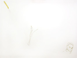
Icarus unsatisfactory sky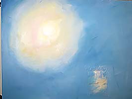
2/21
The sky color is better in Icarus, but now I wonder if Icarus' experience in my sky was too Disney-like, rather than exhilarating.
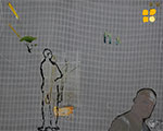
Meanwhile have begun work on an Outlook-based computer piece, Homage to Heraclitus & Einstein. Besides the head, scrap, and blooming bulb elements from Outlook, there's a grid element, which has eluded me through 3 tries. Want it to be orderly, yet "warped," as a river flows and time-space is dented by objects.
2/22
Homage to Heraclitus & Einstein continues. Used two different grids, one from a shot of netting, another I constructed. Added windows, brought them and the sun scrap (also moved a part of that) up more, Created a square piece of earth for the bulb to grow in, and strengthened the bulb.
3/4
Have refined selections for solo show from 35 to 21. Showing them to two artist friends helped my realize a blindness I had. Several pieces had become invisible in my mind because I had seleccted them "ideologically." They were great examples of the "Oversoul" theme, which is:
We live in succession, in division, in parts, in particles. Meantime within man is the soul of the whole; the wise silence; the universal beauty, to which every part and particle is equally related, the eternal ONE. And this deep power in which we exist and whose beatitude is all accessible to us, is not only self-sufficing and perfect in every hour, but the act of seeing and the thing seen, the seer and the spectacle, the subject and the object, are one. We see the world piece by piece, as the sun, the moon, the animal, the tree; but the whole, of which these are shining parts, is the soul.
But, great ideological examples or not, these pieces didn't fit into the look of the exhibit, and were not even necessary for the viewer to "get" the theme.
Conviction is so necessary to be an artist, yet is so dangerous.
Touched up Emerson's Nature (1/2/2007) before printing it for the show. Took about 3 hours. Got more sensual and better composition, the tenor shifting from dark and mysterious to lovely and mysterious--I hope.
3/6
Yin Yang Shi, archival computer print, 15x12 in.
Worked on Yin Yang, the 6x4 print made for the Chesterton Art Center's Artist Book in 2003, to make a 15 x 12 print. Changed some values, brought out the swimmer, brought the apple's color in sync with the other orange/rusts, and cleaned up many artifacts caused by enlarging. It is a handsome print, more "readable" than the smaller version. "Shi" is large in Chinese.
3/12
Aggravating day. I knew I had five frames for the five 3 x 4 ' paintings for the solo. As I started the actual framing, I found that three of the frames were for standard stretchers, whereas the paintings were heavy-duty stretchers.. Then one of the paintings,"Nearly Simultaneous," began to really bother me: the floating woman just didn't look right. Figured out she was too corporeal. Repaint? Necessity struck. I began to scratch back to the canvas with crosshatch strokes. Took a while to find out what blades, stance, control to get the right feel for the scratch-out, but eventually worked--I think. Will see next time into the studio. The only thing that seemed to go right, as blades spilled, screws stripped, I tripped, frame wires in wrong place. Usually such a klutz day would mean that artistic work would stink, but the apparent success of the scratch-out taught me to try, at least until an art effort clearly isn't working.
3/21
Framing finally completed. Working on Homage to Heraclitus and Einstein. Now it has gotten rich enough in images, so will begin "conducting" it into a stronger focus.
3/29
The show is up. Cleaned up studio, then had to go home to print a piece for the Evanston Art Center Spring Benefit. It had been so long since I had painted that before I left, I found some paint and a brush, and flicked a long splatter on Outlook. That asked for a responding splatter. After 3 1/2 splatters, I had a good pattern. Kept the drips from dripping too much, and will see what develops when I get back to studio.
Printed Palimpsest Yin Yang in new, more vertical dimensions, to fit a mat and frame on hand. Took several tries, but one looked good--and surprisingly not much different from its square printing. I need to mull that over.
3/30
Inspiration struck re Outlook. Filling in each section of the time-space, warped grid with free brushing of slightly ochre-tinted white with emergings of primary strokes. Fits the feeling of birth/changing flesh, cosmos, and my life.
Wrestling with problem of lights for exhibit.
3/31
Lights still not right this morning, so I snagged a ladder, and fixed them.
Opening went very well, with discussions about work and catching up with friends. Unsolicited comments from artists and collectors about strength of overall exhibit, the statements of the pieces, and the composition and space of the works pleased me a lot.
Click image to see the ART from the opening of OVERSOUL
4/6
Spent a lot of time re-sketching the face in the lower right corner of Outlook. Tricky for getting the right penetrating yet quizical expression, and for dealing with the perspecive distortion as the viewer gets closer and closer to the painting. Did a find a way to build a rich surface yet let the random splashes show through as I fill in the spaces in the warped grid.
As I looked through my sketches, I realized that I'd had more success sketching Jordan, the young man I was mentoring, but who's who moved away. I have hopes, but the sketch says it more fully.
4/16
Paint a bit here. Get the flu there. Do a lot of design and print for artists' groups. Keep the flu. Sketch (I like "Wires vs Rabbit Ears"). Read Sagan again, some I have not previously.
I'm hopeful that artists and other creative types will see that science is not a destroyer of that mysticism and emotion so essential to us; but rather expands it even more. I have never felt so free and large as since I finally, fearlfully and with regret, had to let go of "belief," and accept nature. Sagan expresses this well, usually.
4/18
The man in the lower right corner of Outlook keeps changing. I'm letting the face evolve the character as I paint. So far there's been: bland, callow amazement, thin-hair-mustache tough, and smiling big lug. I've strongly disliked each one.
Dealing with the distortion of viewing, both close-up and far away, the head and shoulder of a figure tucked into a corner is a struggle also. Am I more distorted when I am close to something or when I have distanced myself from it. Both, I would think, lead to distortions mental and emotional. How to deal with this?
4/27
One way to deal with the distortion problem in Outlook is to get disgruntled as I walk by it, and do other things, like work on Homage to Heraclitus and Einstein, frame stuff for shows, jury grants, and continue my "retrospective" at the SSAA Gallery, one piece per month. This month it is from 1966, an oil called Traceries.
Traceries, 1966, oil on board, 10x13 in. 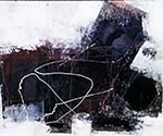
4/27
More framing. Five group and one solo show so far this year.
Brief frenzy today as I looked out the window and saw rain-fresh undergrowth and leaves intermingled in a copse. Toyed with the idea as I drove to the studio. Realized the color mods 'd have to make to make it work as the ground of a new painting, slight shifts of hue and intensity. In studio had to staple canvas to cardboard and gesso because I didn't have the right proportioned stretcher bars. Am fishing around for objects within the ground. So far have maybes of paint rescued from palette, print from photo of white overpaint from gesso on studio tarp, figures from Japanese print, and my sketch of a bird head and neck. Hasn't gathered itself up yet.
5/2
"Gathering myself up" is occurring in an indirect way, I think. Started to verify my catalog for the one-a-month retrospective I'm showing in the SSAA Members Gallery. Soon, I saw that I not only needed my old slides and the database of all my work, but needed to make sure that the older pieces I still had had gotten into the database and/or been photographed. As I'm going through all the pieces in the studio, I am surprising myself, at how I'm reprising in a way. About 25 years ago I followed a path different from today's chaos/unity theme, doing the "Boundaries" series. Looking at the 35-25 year old stuff, I am seeing how another path could have been taken, and might yet merge with what I'm now doing.
5/5
Shooting some 30-year-old drawings, I see their dissimilar statements merging in my current work. Searching for solidity and flux, fascination with human form and feeling, and the strange justapositioning in our minds and even in the world itself--all live together in my works now. Hoping I not being too self-absorbed, I feel very happy seeing this.
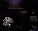
![]()
![]()
![]()
5/7
A prominent gallerist just rejected my work because "it's too representational." As a young artist, I rejected everything representational. Now, that antiquated idea has clomped me on the head! Ironically, both quantitatively (about 10% of the area) and qualitatively (the whole point is to see beyond the visual, to hidden ideas and emotions), the gallerist misunderstood the work, although it was presented to her by an artist in her gallery who did understand and express what the work was about.
It doesn't matter a lot anymore. However, I think most experts tend to see as their peers do, and do not see deeply. (How could they have missed Van Gogh?) It's a mental state where they simply cannot see something, much as we Americans cannot initially hear/speak certain Japanese sounds and conversely.
5/13
Still hunting and probing, from discoveries of older works to some new phenomena in this. To see these images,click on the folder.![]()
5/16
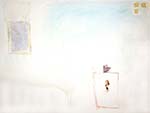
Had an idea for a piece (Gaze, 4/27). Had a frame. Gessoed a canvas (stapled to cardboard). Bought stretcher bars. Liked the rough gesso. An idea came to forget the original idea of brown & green yin/yang, and let sensibility reign as I applied and rubbed graphite. It's gone through two workings, the intuition casing some imagery to arise. Will see. It's called Discernible, and is 22x24 in.
![]()
5/23
I think I fiinished Discernible today. Added some color to the "Mountains," temporarily pasted on the phootographic print of the floor tarp where I put gesso on Discernible a while back, and found a paint scrap in my collection, that reminded me of work I had done back in th 1960's. This "sun" ended up pretty low, creating a new type of composition for me, which is fine, since the piece is about rubbing the past to find the new. Also happenstance and order: the curves from the photographed tarp "line up" with a curve in the rubbed canvas. There are some mysterious incisings in two of the corners, and the other two have diferent rubbings. I like it all.
5/30
Ended up using a transfer (pigmented ink), so that the square image (of drop cloth with gesso outline of this piece) would be transparent. Also kept the tilt of the square. Don't know whether it's a great composition, but it was a challenge to myself. I like the texture-causing, mystery-revealing hand rubbing of the graphite.
On Monday, I made an eight-foot high sculpture from driftwood and trash on the beach. As I was leaving, a woman came up to me and said, "Sir, that is beautiful!" Made me feel good. Also, renewed my faith that some people can see with fresh eyes, since the piece, composed mainly of triangular shapes formed by tree limbs, looks unbalanced at first, but has a hidden right-angle triangle in it.
Also sold a piece to a serious collector.
One of my more rewarding weeks, this!
6/4
Scraped back to the squatting male petroglyph on Icarus, accidentally making a blue spot in the "reserved" aea below him. Fitting the sense of the real and the symbolic that are in this work, I left it. The scratch-back does not look look right, spontaneous-now yet ancient, so I will paint.
6/6
Exciting day. "T" got juried into a regional exhibit, so now I have to worry about framing it.
6/16
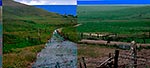
Flint Hills Thoughts
While on the way, I discovered things unexpected and mysteries deepened. Somehow, everything worked out.
The destination was the Flint Hills of Kansas, a few hours southwest of Kansas City. Here was another place, like the hills of southwestern Ohio, where millions of years of change was beautiful. The Flint Hills were at the bottom of a Permian ocean, whose deposits laid down limestone. Now, 250 million years later, they were hills, of great, almost figurative, beauty. While they were spirit-lifting, they were what was expected. Some of the prior stops enlightened me more surprisingly.
In St. Charles, MO, Jane and I walked down a street called “Boonslick.” It was called that because Daniel Boone and his sons settled in this area towards the end of his life, and they cut a trail to their salt business. This trail was part of the Oregon Trail, and began the Sante Fe Trail. St. Charles, at the time of the Boones, was the departure point for the entire Lewis and Clark Corps of Discovery, where the boats and those who came overland from St. Louis formed up. At this same time, the founder of Chicago, de Sable, lived here, having sold his trading post at Chi-ca-gah. He, by the way, had a post several miles from where we now live, before he went over to Chicago. In fact, his full name, Point de Sable, comes from the giant dunes that were at the mouth of Trail Creek (now in Michigan City, IN). St. Charles is a place for as much reverence, if that is the right word, as Chartres. I am not thinking of Beauty, though. Like Chartres, St. Charles embodies the spirit of a people; only here it is the spirit of my people. That brush with reverence, I had not expected.
Visiting the St. Louis Art Museum was a mental and emotional kick. Seeing on of Monet’s late water lily paintings, I realized, as I had not at MOMA or the Monet Exhibition at the Art Institute of Chicago, how “empty” the center was. Did this affect, unconsciously, my expression of the Zen center of things? I’ll have to look at other of this series again.
 I saw a Kandinsky that, better than any other I’ve seen, expressed what he said he wanted to do. His “Winter Landscape” of 1911 has the music, the abstraction to the ideal, the spiritual--all that he may have focused on too intently later in his career. In this piece these are all related to nature, in a striking composition. A most revealing act of esthetic thought.
The Kline, Rothko, and Motherwell were rich examples of each artist’s work. It was like jazz while a bridge is being built (Kline), an hour of “om” (Rothko), and feeling elemental forces and beauty (Motherwell). I hadn’t realized Motherwell used a slightly more blue and slightly less matte black than Kline.
Stella gets more weak every time that I see a piece of his. Polke and Richter can’t get by with their “quoting” meaninglessness,” when seen next to Kieffer. Kieffer’s work, while so unlike mine, is totally rich, and will last. Unlike Stella, Bearden gets deeper and richer. With him, I never feel like saying, “I’ve seen that.”
A superb hanging had Marden next to Diebenkorn (Ocean Park No. 68). While Marden captures a smidgeon of human experience, Diebenkorn includes the accidental in a more rich way. If you know his earlier, expressionistic figures, you can understand the energy/expressiveness playing off against the lovely yet surprising order. For a while, I wondered if my love for Diebenkorn’s work rested on a “prettiness” foundation. Seeing this work reminded me that his work is far from pretty. It is Beauty and Truth.
There was also a room devoted to a rising artist, Angelina Gualdoni. Some of her works did have a too-pretty feel in some areas. Also, her figures do not match up to the rest of her painting. But, her strongest pieces strongly mixed the decrepit (urban abandonments) and the orderly (underlying composition). I bet she becomes very important.
The Kemper, in Kansas City, MO, had some inspiring stuff and some trivial stuff. The trivial included most of the show “Phantasmania,” and “Picturing Artists: Photographs by Dan Budnik.” The “Phantasmania” blurb gives a strong clue: “Phantasmania examines a distinct undercurrent in today’s artistic consciousness that is a response to today’s pervasive climate of war, globalization, and rise of mediated information and experience.” More like cheap sci-fi illustration combined with political correctness. Yech! The only piece with what seemed like real thought (i.e. deep yet ambiguous) was also fun. I forget the artist’s name, but he constructed an imaginary environment about chest high in parts and sprawled about twenty feet on the floor, of a “city” with strange-looking creatures, doing some of the things we do. It had a backside to one building with a monstrous (by comparison to the other critters) creature. Made of decrepit materials, it was yet thought out. Thought-provoking, it was yet funny and fun.
The best exhibition at the Kemper was “Putting the U back in Curator,” which centered “around notions of collaboration, participation, authorship, community, and curatorial practice. On May 1–3, Museum staff invited random willing visitors to actively participate in the curatorial process by personally selecting artwork from the Museum’s collection to be included in the exhibition. Once selected, the artwork was pulled from the vault and installed in the selection order, injecting the gallery’s atmosphere with a sense of multiplicity and chance—the result of a truly collective process.” Strong works were chosen for the most part, although one guy chose a Richter because he liked the hairstyle, I think. The idea was good, for all the reasons in the quote. I liked Joan Levy’s “Trees in Counterpoint.” Hung Liu’s recent works captured her Chinese ‘roots,’ felt through the existence of a contemporary woman. More like Sikander than the artist who photographs women with Islamic writing on their face, burka, and background, Liu mixes it all up. I am a little unsure about the “slick” faces, but have to work out if that’s part of the statement.
6/20
Struggling to get the "petroglyph" Icarus to be both ancient and now. Gave him more butt and leg to suggest a squatting figure, but the colors that will work haven't shown up yet.
6/21
Got a charge out of my ceramics, as I was preparing porfolios of stoneware objects and wall hangings for an exhibit submission. I'm going to look around here for a place to get muddy again.
6/23
Light is simply fascinating. I was looking out a skylight this gray morning, then closed my eyes. Soon, the afterimage took over. I don't think the sky was simply gray at all, since the afterimage became a subtle red orange, beautifully luminescent in my dark, closed-eyes vision. That means the cloudy sky was really a blue-green. When I open my eyes and look again, I can pick up the subtle blue in the gray, but do not see the intermixed green very well. Why is that?
The mind-eye show behind closed eyelids is as rich as music. Even the "white" ceiling turns a glowing indigo, I suppose because it was reflecting the yellow-orange tablecloth. This is so involving of the senses and the mind, a zen moment.
6/26
Finished Homage Einstein Heraclitus, a computer print. Kept a record of the six stages 'til completion. I had thought the grid and weave ground would be a big driver, but it didn't turn out that way. The piece has kicks here and there, but is not the earth-shaker I thought it would be. Perhaps what I experienced will emerge more richly in some later artwoks.
7/4
Maybe it's the season. Artworks are going off like fireworks. Most likely, however, it's just the way things go, randomness and necessity.
First, I re-did the "window" of the real on the painting "Icarus," after I removed the masking tape that protected it from the sky. The edge was TOO raggedy. Also there was a warp in the rectangle that I liked, and emphasized, the cleaner edge speeding up the movement.
Then, a friend, in discussing my recent work, said she preferred the more richly colorful pieces. Enlightenment. Although I liked the second-last gray piece, "Discernible" (5/30), the most recent "Heraclitus...." (6/26), was not very stimulating to me either. So I started something different, tentatively called "Peering." Still awkward, I have some hopes for this piece.
![]()
 Peering, computer print, 15x12 in.
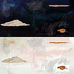
Then, another friend wrote about my recent Flint Hills experience, having herself stomped that area. In looking at her work, I found her photo of California, and I wanted to fashion a visual comment. It ended as "Hills Kansas California," whose offset blues work for me as remembrance of seas past, the unsettling nature of art, and ideas forever. What was to be an hour of work, took two days.
![]()
 Hills Kansas California
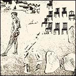
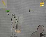
Then, I had upgraded to CS3 from CS2, and wanted to try something. Once started, I finished, again after several days and four or so hours, with "Man Turning His Back," a "new" drawing from a computer print ("Yellow Tape Man").
![]()
![]() Man Turning His Back, drawing, ink, 12x12 in.
Man Turning His Back, drawing, ink, 12x12 in.![]()
Finally, as I was working on the drawing, I was asked to submit a work to the Hyde Park Art Center in Chicago, for the "Just Good Art" benefit. Although I usually prefer something other than an outright donation, this show has such good work that I started checking out things I might send. Seeing "Calming Edge," a computer print from several years ago, I decided to rework it. Usually I don't rework pieces, but I wasn't happy with the resolution of the original, and as I worked on fixing it, I saw that it wanted to be better. And here I was, having just worked on the key figure in making the drawing "Tuning His Back!" Now, there's a better feeling of the conflict. Better composition. Clearer, yet mystifying "landscape."
![]()
_sm.jpg) Calming Edge, OLD, computer, 15x12 in.
Calming Edge, OLD, computer, 15x12 in. 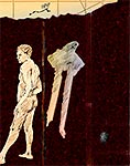 Calming Edge, computer, 15x12 in.
So, off in many directions. Or, perhaps it just seems that way right now.
7/12
Took a trip to Milwaukee. (The Ambassador is a good Art Deco & jazz hotel.) The look through the Art Museum provided a few insights. Georgia O'Keefe's Lake George Autumn was a warmly-hued surprise. I can see why she would like Arizona, but I also am suspect of her artistic reasons to move. If she could find such dynamic stuff to paint in the East, perhaps it was her dislike for the Steichens that really motivated her move to New Mexico.
And Alex Katz didn't fail to disappoint. His White Lilies (1966) were as vapid as his later portraits. The accepted wisdom that he is PAINTING/critiquing vapidity seems unlikely for two reasons: this previously vapid style, and the basic artistic fact, true of writing also that if you need the audience sense boredom, you don't write boringly.
Braque's In Drydock, painted in 1942, was explained as trying to solve cubism in the real world. If so, it was such a failure, a mishmash of illusionistic and plastic space, of decorative and solid, that I wondered if his great Cubism venture was just a refuge for man without good esthetic thinking. Then I saw a piece he had done before Cubism, Seated Nude (1906). That answered my question with a slamming NO! Such great form, color, exploration.
7/16
I'm spending most of my time getting ready for a group show at the Lubeznik Center for the Arts, "Work in Progress." About a dozen of us will show a piece, and documentation of how it developed.
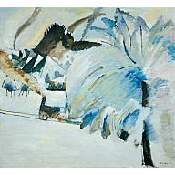
![]() Three Horizons, acrylic, 60 x 24 in.
Three Horizons, acrylic, 60 x 24 in. ![]()
7/18
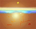
Found a rock that inspired what might become a key icon in future works. With a whitish circular fossil surrounded by the dark, somewhat triangular rock, it suggested to me Alpha and Omega, beginnings and endings, from mineral to life to mineral. I reworked it for quite a while in PhotoShop until it looked right. I am anxious to see how it breaks into new art.
7/25
Another sky, including sun, in Icarus. Another need to do them over. Not exhilarating enough sky color. Will try sun in oil, since acrylic doesn't respond to me there, nor I to it.
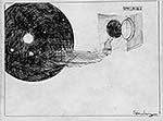
<= Finished computer piece Unexpected, whose beginning came from an inspiration after I tested something in my camera with a random shot out the window. The night after the shot, I was looking out the bedroom window, also with blinds, twisting and playing ideas, when the idea of a rotated match-up came. A week and many hours later, the subtle intent migrated into something else as I worked. It, and the feeling of the piece itself, were unexpected.
8/7
The nth re-do of the sky in Icarus looks good. Four blues and two yellows. I think I will do the petroglyph/Icarus in oils, to preserve the rugged texture left when I pulled off the masking. Looks rock-like.
Did a gift print, based on "Adrift," a painting from the 1990's that Kay liked. It's called KK Paradise.
Donating a piece to WNIT auction. I will do three donations a year: The Evanston Art Center, because of friends and the fair way the EAC treats artist/donors; the Hyde Park Art Center, because its fame as an art venue is a fair trade-off; and WNIT, because they respect artists enough to at least give them a free membership. Between these latter two and the Chicago Art Open, been doing much prep work. Also moving to storage and double-checking the cataloging of older artworks.8/15
Finally, I feel great! After working hard at laying in Icarus sun, it became the driver for the painting. Standing back, I saw how the petroglyph figure would work, and, mainly, that the bare canvas, where "reality" resided, would have to go dark. Within that dark, irregular rectangle, the collaged detritus will remain, but the Icarus/petroglyph figure will now be remembering his yin flight and contemplating the yang. It's good to have art take me up again, to "escape" the mundane for a while.
![]()
![]()
![]()
![]()
![]()
![]() Previous
Previous ![]() Top Next
Top Next![]()
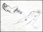
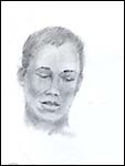
pencil, 12x9 in.
computer, 12 x 15 in.
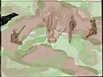
acrylic, 36 x 48 in.
computer, 12 x 15 in.
computer, 15 x 15 in.
computer, 12 x 15 in.
computer, 14 x 11 in.
computer, 15 x 12 in.
computer, 15 x 12 in.
pencil, 12 x 9 in.
pencil, 9 x 12 in.
preliminary sketch
early stage
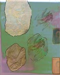
acrylic & collage on canvas 22 x 24 in.
acrylic & collage on canvas 22 x 24 in.
computer, 15 x 12 in.
computer, 12 x 15 in.
computer, 12 x 15 in.